For the background of my DVD wrap i decided to use the background from Lacuna Coil's current album, "Shallow Life', as the DVD is going to be the tour version of the album.
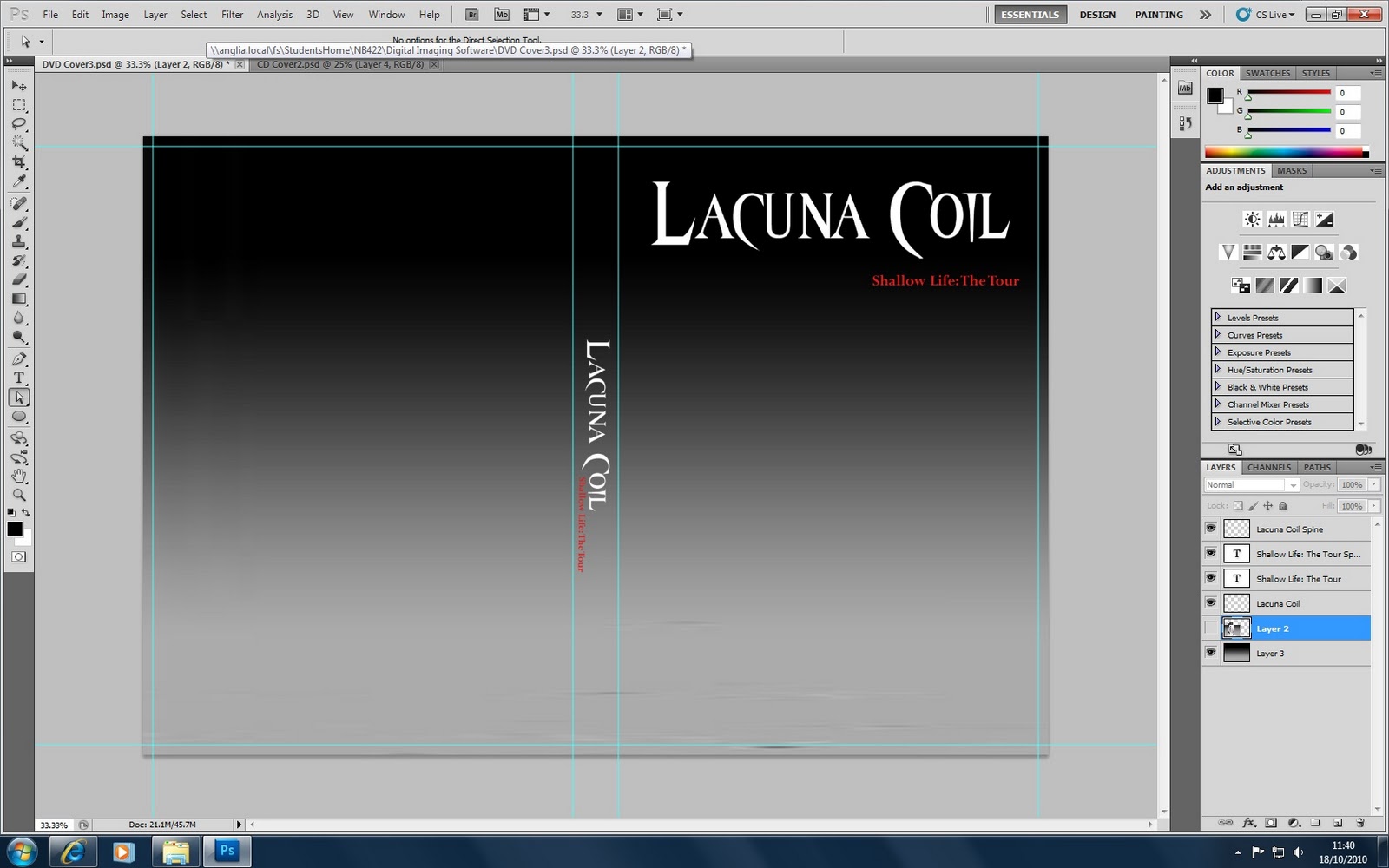
In Photoshop I took the image of the album cover ( as seen on the right) and enlarged it so that it was the same height as the DVD cover. I then tried to use the gradient tool and chose a black and grey, which were used on the album, using the colour select tool to get the exact same shade. I kept altering the gradient so that it matched the image however, I found that I couldn't get the exact match. I was unhappy with this, so I decided to just cut a snippet of the background from the image and then using the 'transform scale' option in Photoshop, enlarged it so that it covered the entire DVD background. This then matched the background perfectly.
I also added 'Shallow Life: The Tour', the title of the DVD, just under the bands name too. I went through a number of fonts and eventually chose the style 'Perpetua'. I chose this style because I thought it complimented the font of the bands name above. It wasn't to dissimilar to the font i'd used for the band's name, just a bit simpler which was more appropriate as I didn't want it to be too distracting, plus it's very easy to read. I also chose to make the text a red colour, which I selected using the colour chart in Photoshop. I thought that the contrast between the black background and the red text worked well, plus the two colours are often associated with 'dark', 'gothic' themes. It helped the text to stand out too despite it being in a small font size.
Additionally, I then added the bands logo and title to the spine of the DVD, again using the 'transform scale' option to decrease the size of the text to fit the spine correctly so it wouldn't over run. I chose to put it in the centre of the spine too as I preferred this to either putting it at the top or the bottom. Throughout this process I made sure to keep creating new layers and naming them, which made it much easier to edit certain aspects of the cover.
I wanted to use the same background on my CD cover that I had used on the DVD. I did this by copying a small section of the DVD cover and then pasting it into the CD area I had created using guides so that it was the correct size. I used the 'transform scale' option again to create a square box. Then using the 'eliptical' tool and holding down shift so that it didn't blur the image, I cut out a circle, and deleted the outside of the remaining image. I then used the 'eliptical' tool again to create a smaller circle in the centre.
I added the band's logo and the DVD title onto the CD as well, making them slightly smaller so that it fitted within the circle correctly. I made sure to create new layers at this point as well, which made it much easier to work through.
I wanted to incorporate the grenade image into my products as this had been featured in the artwork of the 'Shallow Life' CD so I felt it had to be featured in the DVD too.
Using the image I had earlier of the CD cover in photo shop I wanted to cut round the grenade image. I was able to use the 'magic wand' tool to get rid of some of the background, but this did not work well towards the end as some parts of the grenade were a similar colour to the background and the tool did not detect this. Therefore, I had to use the 'Pen Anchor Point' tool which I had to go round the image carefully selecting points and then joining two ends of the area so that I could delete the outside of the image. This was quite time consuming and took a lot of accuracy to make sure it didn't cut into the image, but it did work well in the end. Plus, I only intended to have a reasonably small image of the grenade so it did not matter if the outline was not absolutely perfect.
Once I had the grenade image only, I decreased the scale of it and placed it on the spine of the DVD cover at the very top. I felt this was the appropriate placement of the image, as I intend to have some DVD logos perhaps at the bottom of the spine to add to the authenticity of it.
Also, once I have taken an image of the band for the front cover of the DVD, I intend to have the female singer holding her hands out towards the camera, which I shall then place the image of the grenade to make it look like she is holding it.