Wednesday, 8 December 2010

Completed CD Wrap

This is the completed CD wrap...


There's not much I had left to do with the CD wrap apart from add a couple of things to it.

Firstly, I added the text 'Disk 1' as there was going to be two disks within my DVD product so I had to clearly state which CD was which. I created a new layer and named it 'Disk 1' so I knew what it was. I then created the text by clicking on the 'T' symbol on the at the left hand side of the window. I used the same thought that I had been using throughout, 'Perpetua' and kept the text white to keep with the colour scheme that I had been using. I decided to put the text just under the band logo and the title of the DVD as it was easily noticeable and would be the first place the audience would look for the text. I thought it would look slightly 'random' just plonking it at the bottom of the wrap. 

Also, I decided to ass some copyright text, which I had gotten off another CD. This was quite fiddly to do and took quite a while for me to get it how I wanted it and in the right place. 

I started out by created a new layer and drawing a new circle by using the 'ellipse tool'. Once I drew the circle, it wasn't the right size so I went to the 'Transform' and 'Scale' option at the menu at the top and adjusting the circle and moving it so it fitted just within the original CD circle. As soon as I had got the circle to the right side, I clicked in the 'T' on the menu at the left, so that I could add some text, and clicking the outer rim of the circle I had just created. I copied the text from my blog, where I had added the copyright information previously. I then pasted the text and  it went round the inner circle. 

I wasn't happy with some of the text as it didn't fit perfectly round the circle how I had envisioned. So, I went to the 'Transform' option at the menu at the top again and clicked the 'Warp' option. This allowed me to move the text slightly by dragging out the boxes it had created around the text, making the text go round the CD in a more even manner. Also, I went to "Transform' again and then selected 'Rotate' as the text wasn't positioned in the right place around the CD. I used this tool to the the text so that where the text line finished and ended at either side of the CD, were at the same point and even, and that the text was more centred. 

I used the same style font, 'Perpetua', that I had used throughout my work and chose the colour white like before, so that it went with the colour scheme I was using. I kept the text reasonably small, as the text I had seen other CD's was considerably small in comparison, as it wasn't suppose to stand out, just be there for legal purposes. 

Finished DVD Cover

This is the completed DVD cover...


I decided to move the blurb slightly to the right hand side of the page, and changed the image of Cristina to the left hand side. I chose to do this because I felt the text looked to crowded directly above the 'Disk 1' text, so I swamped it to the other side as the 'Disk 2' text was much further down the page. The Cristina image therefore, breaks up the text so it doesn't look as squashed. 

I have also changed the placements slightly of both the 'Disk' texts and the images between them. I wanted to make the 2 images showing some footage form the DVD, so that they were directly in the middle of the page as they looked much better this way and stood out more on the cover. As a result of this, I moved the two 'Disk' columns so that they were more in centre of either side. 

I was tempted to put more images above and below the 'Disk 2' text, I did try this but I decided that it made the back cover look too crowded with images and just didn't work.

Furthermore, I have now got rid of the white background that was on the barcode and it now looks much better on the cover and matches the other symbols I have added too. I deleted the white background by going to the menu at the side where it shows the layers and selecting 'Multiply' from the list. 

I added the rest of the symbols to the back cover too, such as the DVD logo and the Century Media Record label logo too. I used the images that I found using Google Images earlier and imported the files into Photoshop and put them on different layers. Like the barcode, they had white backgrounds, which I got rid of by using the same technique, selecting the "Multiply' option in the menu to the right hand side. 

Additionally, for the 'Exempt from Classification' Logo, I had to use the 'magic wand tool' to select the logo and used the 'fill' tool so that I could change it from it's original colour, that was green, to black so that it matched the colour scheme used. I used the 'Multiply' technique again here to get rid of the background. I also created a new layer to add text to the logo. Next to the 'E' symbol,  I added 'Exempt from the bbfc classification' just to make it clearer to the audience what it meant. I made the text quite small so that it fitted with the logo, and used the font 'Perpetua' again, which I had used for all of the text on my DVD cover. Once I had added the text, I selected both of the layers and merged them together. 

For the copyright information at the bottom, I added in the 'C' logo, which I had to change the size of as it was way too big to start off with. I did this by going to the menu at the top and going to 'Transform' and then 'Scale', whilst holding down the shift key, I adjusted it to a more suitable size. I then added the text using the 'Perpetua' style font, and added some copyright text which I had got off another music DVD. 

I decided to add the DVD logo to the front cover as well as I noticed that some music DVD's have the symbol either on the front cover, or the spine too. I thought I would put it on the front to make it clear that it was a music DVD to the audience. I chose to place it in the bottom right hand corner as there was some empty space at the bottom and I felt that it was the ideal place to put it, instead of at the top where there was already some text. 

On the spine of the DVD, I chose to add the Century Media Record label logo again as I had noticed that on some music DVD's, they had placed the record label logo there.  I chose to put it at the bottom of the spine as I already had the grenade symbol at the top and felt that it would look more balanced if I added something to the bottom. 

Additionally, after much deliberation, I eventually chose to keep to the old Lacuna Coil band logo I had designed originally for the front cover. I felt that the new updated one, which had the small grenade symbol over the letter 'o' in 'Coil', didn't work so well on the spine as it was smaller and I didn't think it looked as good as the original. This worked out fine anyway, as I had stuck to the original logo on the CD wrap as I didn't think it would work having the new logo with the grenade in over the background of the CD, which had an enlarged grenade on it already, it would've looked too much. 


Also, throughout the later stages of my editing in Photoshop, I decided to group layers together as it became difficult finding the layers I wanted as I had so many. 

I put the layers in three different groups: 'Front Cover', 'Spine' and 'Back Cover'. This made it much easier to find the layers I wanted. I also had some groups within the already grouped layers, such as 'Images' and 'Symbols' within the 'Back Cover' group, to make it even easier to find my layers. 

Tuesday, 7 December 2010

Finished Video

This is the finished Lacuna Coil Promotional Video...


I have changed several things from the rough edit...

Firstly, after much fiddly re-editing I managed to get the video down to 1 minute and 2 seconds, which is  a more acceptable time. I did this by cutting down a large amount of the music video section. I decided that I needed to cut them dramatically as my original aim was to only show different clips of all the videos over a few seconds, and some of the clips went on for far too long. 

I also cut a very small section of the behind the scenes footage, when it shows the making of the video, 'Spellbound', and bought forward the second live video slightly.

Additionally, I had to alter the second song, "swamped' Slightly as it obviously went on for too long after I had re-edited the clips. However, I still wanted it to end in the same place as it felt like it came to the end, so I was able to fade it out and it worked without seeming to end abruptly. Therefore, I decided to miss out the second half of the chorus as it only repeated the first part anyway. This way it didn't seem like it skipped any part of the song and still ended in the exact same place which matched the videos. 

Furthermore, I adjusted the size of some of the clips so that they were all the same size and filled the screen. This way it didn't look like the clips were all taken from different videos so much, as they were all the same size on the screen. 

Monday, 6 December 2010

Rough Video

This is the rough video...


There are still some issues with this video that need to be addressed. 

Firstly, the video runs over by roughly 20 seconds, when the promotional video should only last 1 minute. Therefore, I need to somehow re-edit the video to make it shorter and cut the song as it currently finishes and fades out in just the right place. 

Also, not all the videos are the same size either. This because not all the videos were the same size when I downloaded them off YouTube and therefore, I will need to adjust the sizing in Premiere so there is not a noticeable size difference between the different clips. 

Some of the footage varies in quality, but unfortunately i cannot help this as I wasn't always able to find such high quality videos on YouTube. For example, I would prefer the live videos to be of better quality as they are slightly pixelated in places, however, these were the best live videos I could find on YouTube. 


Sunday, 5 December 2010

Copyrights/ Regions/ Ratings

CD
All rights of the owner and the producer of the reproduced work reserved. Unauthorised copying, hiring, lending, public performance, radio or television broadcasting of this DVD prohibited. 

DVD
The copyright on these sound recordings is owned by Century Media Records. 


Image found at: http://www.copyrightauthority.com/copyright-symbol/


Region 2 Symbol
Image found at: http://adrianwarren.com/faq/ontheroad.shtml


Exempt from classification symbol, as it is a music DVD
Image found at: http://en.wikipedia.org/wiki/E_certificate


In Photoshop, I will edit this logo so that it is green and not black to match the colour scheme used.

Friday, 3 December 2010

DVD Cover - Rough


This is a rough copy of the DVD. 

I have now added a 'blurb' describing what the DVD is about and what the audience can expect from the DVD. I have placed it towards the top of the page as it should be the first thing the audience reads when looking at the cover. 

I have kept the font style as "Perpetua' to match the rest of the text on the cover. I have also kept with the colour scheme, and kept the text white as I think it works well against the black part of the background, and can easily be read. 

The same applies to the 'Disk 1' and 'Disk 2' text, I have kept the same font and colour for the same reasons. However, I have made the 'Disk 1' & '2' text bold as it separates it from the tracklisting info underneath it. 

I have also added some images to the back of the cover to make it more interesting and so it appeals to the audience more and gives them more insight as to what they can expect to see on the DVD. I have put a main image of Cristina (the singer) next to the blurb, however I am unsure of the positioning of this so it could change. I have also added some images (interview, backstage, music video) which shows footage from the DVD, in the centre of the cover to break up the two Disk listings. 

A barcode has been added too, which is a necessary so people can buy the DVD only I have to make the background white so it works better with the background.

I still have to add the rest of the symbols and logos, such as regions and age ratings. 

Premiere


To make my promo video, I used Premiere. I set up a new project and then imported all my videos into the program, which then appeared on the left hand side of the screen. I doubled clicked on the videos so that they came up in the first editing window, where I then watched the video and placed markers at points of the video that I wanted, and then dragged them onto the timeline. 

For the first part of the video, I mainly wanted just the audio from the video. So I adjusted the level of opacity of the video so that it didn't appear on the screen but I could still hear the music. 

I made sure to edit all the videos to the beat of the music. I mostly used just the audio from the music video of the song 'Spellbound', for the first part of the video, and turned all the other audio from the other clips off. Some clips were slightly too long and didn't go with the song, so I adjusted the length of them by simply dragging them back and fourth to adjust the length. 

About half way through the video, I decided to fade out the music track and have some audio of a couple of the band members talking, to give the audience an insight to other aspects of the DVD they can expect to see. Whilst the members were talking, I overlapped another video, changing the opacity so that it began to fade in once the members had stopped speaking, but keeping the music present and gradually getting louder throughout the interview footage. It then cut into a live video of one of their classic songs 'Swamped', which featured the singer, Cristina, talking to the crowd at the beginning. As soon as she's about to sing, I cut to the official music video for the song and used the audio form the music video too, to try and build suspense and make the viewer want to buy the DVD. 

At this point, I then decided to show all the bands music videos, as the DVD is going to have the band's entire music video collection. I took each of their music videos and edited them in the editing window. I again used markers for this as I didn't want to drag the entire music video onto the timeline as it was unnecessary. I wanted to try and keep all the music video footage on a single track. 

Once I had got all the clips from each of the music videos and placed them on the timeline next to each other, I watched them back with the 'Swamped' music track, making sure all other audio was turned off. Some of the clips went on for a bit too long, so I simply dragged them until they were the right length and matched to the beat of the audio track. Also, I cut some of the clips up, using the cutting tool, as I didn't always want the clips to run exactly the way they did in the music videos, so I cut some shots out as I was on a time limit. 


I also made some title screens throughout the video to introduce the video and show what the DVD consists of.

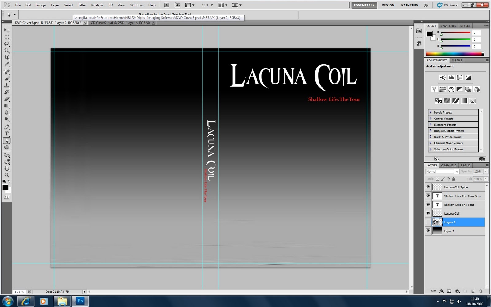
The first title screen is of the band's logo. In Photoshop, I made a new file and copied and pasted the Lacuna Coil logo from the DVD document. I then saved the new file and imported it into Premiere. Once it had loaded into the program, I dragged the file onto the timeline. The logo was far too big at first, to the extent that you couldn't see much of it at all on the screen. So I shrunk it down my clicking on the corner of the text and dragging it inwards until it was the right size. I then moved it about so that it was in the middle of the screen. I adjusted it's opacity too, my setting different points on the clip, so that it would fade in and fade out.

I created all the other title screens myself, without the use of Photoshop. They were simple title screens, such as 'Behind the Scenes Footage', 'Music Videos' etc, just to show different aspects of the DVD. I created a new title screen by going to the 'Title' menu at the top of the program and selecting 'New Title Screen', 'Default Still'. It then displayed a new window like the one above. I clicked on the Text Box icon and then drew a box for me to type the text I wanted. 

Once I had typed the text, I then changed the font to "Perpetua', which was the same as the font I had used for the DVD and CD artwork. I also made sure that it was in Bold and was in the centre of the screen. I decided to keep all the text in capitals as the logo was in capitals only, and I thought the text generally worked better and looked more professional. I chose to keep all the text in each title screen white as well to keep with the colour schemes I had already used for the DVD and CD artwork. For the DVD I had kept the text white against a black/grey background. Therefore, I kept the backgrounds black too to get an effective contrast between the white text and the black background. 

For some title screens the text was in the complete centre of the screen, but for others it was sometimes slightly to the top. I changed the placement for some of the title screens because I made them fade in and out too, and depending on the videos before them it worked better having them at the top so you could see more of the footage before the fade in. 

Additionally, at the beginning of the video I decided to have the 'Shallow Life: The Tour' text on the same screen as the live video instead of on it's own black background like the other title screens. I did this because I wanted the name of the DVD, to come up on the screen as soon as the music started to come in properly. However, I also wanted to show the live footage at the same time, because it wouldn't work to just have a title screen once the music starts to kick in, I felt it needed more action. So I created the title screen anyway, then changed the opacity of the background and had it so the text displayed on beat, at the top of the screen so you could still see the band fully as well. 

Furthermore, I created several title screens towards the end of the promo vid when I decided to show all of the bands music videos. I created a title screen each time a new video was shown, displaying the title of the video. For these ones I did not make the text bold because I didn't want them to be as abrupt and take too much attention away from the video. I moved them around a bit too, so they were displayed in the corners rather then directly in the centre. I did this because I wanted them to be more subtle and to make sure that the main focus of the screen was on the music video and not the text. I tried to put the text in the darkest point available on the screen because I had used white text, which obviously working better against a most contrasting darker colour. 


Tuesday, 30 November 2010

Videos and Ideas

Live Videos


It is important for my promo vid to feature some live footage of the band as that is mainly what the DVD will feature. However, searching through YouTube, it was hard to find some high quality live footage of the bands performances. I did manage to find some videos from a live show they played at Graspop, Belgium, which were the best quality videos I could find of their live performances. I am not too worried about the quality of the sound in the videos because I intend to only use mp3's of their songs rather than the sound in the videos. Although, I might use some of the opening speech from the singer in the videos as a way of introducing the DVD and then bring in the mp3 tracks, showing a collage of the rest of the video clips I intend to use.


Music Videos


These are all the Lacuna Coil music videos ever to be released. I feel that it is important to try and incorporate as many in my footage as possible, as I have advertised on the DVD how it will feature all their music videos. I only intend to use a few seconds of each video, cutting different clips of them to the beat of the mp3 I choose.


Extra Footage


These are some clips of interviews and behind the scenes footage. It is vital that I show bits of these clips in the promo video to show the audience bits of the bonus features they can expect to see on the DVD. I might show the 'Walk on Stage' part at the beginning of the video to try and build up the anticipation and the atmosphere before the show, bringing on a few text screens introducing the DVD and what it is.

Change to the Logo on the DVD


As I have changed the original idea for the front cover, as I was going to take my own photo, I have decided to incorporate the grenade image into the band's Logo on the cover.

My first idea was to take an image of the band, with the singer holding out her hands to which I would edit in the small grenade symbol. However, I changed my mind and decided to get an image off Google instead. I could not find one with the singer holding out her hands, so I decided I would add it to the logo.

For the letter 'o' in Coil, I changed it to have the grenade symbol over the top of it as it was the same shape. I changed the sizing of the grenade to match the size of the rest of the logo, which I did through transforming the scale in Photoshop.

Once I had finished resizing the image so that they matched, I selected the two layers and right clicked on them, and merged them together into one. 

However, I decided to keep the unchanged logo on the CD wrap because I felt it worked well the way that it was and didn't need to be changed, because the image of the grenade worked well in the background and wouldn't look right being in the logo too.

Images for DVD Cover


I searched through Google images to try and find some live images of he band to place on the back of the DVD cover, to give the audience and insight of the kind of footage they can expect to see on the DVD. I chose to incorporate this photo onto the DVD as I felt it was important to have a close up live image of the lead singer because she is the most important member of the band. 


I chose this image, which I found on their official Facebook page, because not only does it show a clear live image of the band, but also the audience. I felt this was important because the audience is what makes the show and adds to the atmosphere. It also shows they appreciate their fans and the audience. 


I searched through Google images again to find some interview footage, to show some of the bonus footage on the DVD. There weren't many interview images but I eventually found this one, which is good enough. 


I searched through images on Flickr too, to try and find some backstage footage of the band. I eventually came across this one, which shows the band after they have just come off stage. This illustrates to the audience that they can expect to see exclusive backstage footage of the band on the DVD.


This is an image from the band's Spellbound music video. This is one of the most popular songs on their latest album. I chose this image to again show the video section of the DVD. 


I found this image on Flickr, which is taken from the bands most famous music video, Swamped. I chose this image, as it shows that the DVD even has classic Lacuna Coil videos on as well as their latest ones, to appeal to the audience even more. 

Thursday, 25 November 2010

Text for DVD Cover

Here is the text which I shall put on the back of the DVD cover to give a brief description of the band and let them know what to expect from the DVD...

Lacuna Coil formed way back in 1994, in their home town of Milan, Italy. They have grown extremely popular over the years, especially with their latest hit album, 'Shallow Life'. This DVD not only features their recent live show at The Forum, London on July 31st 2009, as part of their SpellBound Tour, but also features exclusive backstage and studio footage, along with never before seen interviews with the band, and their entire video catalogue.

DVD Cover - Band Image

So my original idea was to take a photo of a made up band, with the lead singer holding the iconic grenade logo. However, I have decided to change this idea and instead find a professional photo of the actual band online, as I thought this would look better because for the promotional video I am now going to use actual footage from the band's live shows, so it would look weird having different people on the DVD cover to in the video.

Therefore, I have found a photo of the band on a photoshoot for their promotion of their Latest album, Shallow Life. Here is the photo...


I chose this image because it showed a clear picture of al of the band members. Plus they are all wearing blacks and reds which keeps to the colour scheme I have already used on the DVD cover. 

I pasted the image into Photoshop, making sure I created a new layer called 'Band Image', so that I could cut around the image to get rid of the white background , so that I just have the band and nothing else. I started to do this to begin with with the 'Rectangular Marquee Tool' tool and pressing 'delete', which I used to cut big blocks of the white background out before I moved on to the finer outline of the image. 

Once I had got rid of majority of the background, using the 'Rectangular Marquee Tool' tool, I went round the image adding points round the outline, using the 'Pen Anchor Point' tool, getting as close to the edges as possible. After setting numerous points around the entire image and then deleting the rest of the white background, I had nearly got rid of it all, apart from the white which was very close to the main image. 

To delete the rest of the white, I added a 'Mask' to the image. I then changed the colour of the pen to white so that I could go round the image, changing the size of the brush by using the square brackets. I then went over the white parts, and instead of deleting the white, it faded it so you could see the original background of my DVD cover. This was very helpful because I sometimes accidentally went over the band instead of the white, so I just had to change the colour of the brush to black and go over it again to get the part of the original image back again. However, this was very time consuming and fiddly to do, but the end result was worth it. 


Monday, 22 November 2010

Things to add to my DVD Cover

Image URL: 


I found this image of a barcode by searching through Google images. I am going to put this on my DVD cover as it makes it more realistic as they always have barcodes on so that people can buy them.


Image URL:


I, again, found this DVD logo image by using the Google search engine. Like before, it adds to the realism of the DVD. 


Image URL:


This is the Century Media logo, which is the band's record label. I felt it was essential to incorporate this into my DVD as Music DVD's always have the record label logos on them. 

I am also going to add a copyright declaration at the bottom of the DVD too. 

Monday, 25 October 2010

CD Cover


This is the completed CD cover....

I decided to put the iconic grenade symbol on the CD to create a connection between the final products. I enlarged it so that it was roughly the same length as the CD, making sure that it never went over the edges. I did this by using the 'Transform' tool and changing the scale of the image, holding down the shift key so that the image didn't blur. I originally placed it in the middle of the CD but decided that it did not look right due to the inner circle of the CD, which made it miss a big bit of the grenade out. Therefore, I decided to move it to the left hand side so that you could see me of the detail of the grenade and the bit that was missing form the inner circle seemed to work well with the rest of the image. 

I decided not to add any more images of text to the CD as I wanted to keep it reasonable simple but effective. If I had've added anymore detail, I think it would've looked less professional as it would've become crowded.  

Monday, 18 October 2010

Backgrounds and fonts


For the background of my DVD wrap i decided to use the background from Lacuna Coil's current album, "Shallow Life', as the DVD is going to be the tour version of the album.


In Photoshop I took the image of the album cover ( as seen on the right) and enlarged it so that it was the same height as the DVD cover. I then tried to use the gradient tool and chose a black and grey, which were used on the album, using the colour select tool to get the exact same shade. I kept altering the gradient so that it matched the image however, I found that I couldn't get the exact match. I was unhappy with this, so I decided to just cut a snippet of the background from the image and then using the 'transform scale' option in Photoshop, enlarged it so that it covered the entire DVD background. This then matched the background perfectly.


I also added 'Shallow Life: The Tour', the title of the DVD, just under the bands name too. I went through a number of fonts and eventually chose the style 'Perpetua'. I chose this style because I thought it complimented the font of the bands name above. It wasn't to dissimilar to the font i'd used for the band's name, just a bit simpler which was more appropriate as I didn't want it to be too distracting, plus it's very easy to read. I also chose to make the text a red colour, which I selected using the colour chart in Photoshop. I thought that the contrast between the black background and the red text worked well, plus the two colours are often associated with 'dark', 'gothic' themes. It helped the text to stand out too despite it being in a small font size.

Additionally, I then added the bands logo and title to the spine of the DVD, again using the 'transform scale' option to decrease the size of the text to fit the spine correctly so it wouldn't over run. I chose to put it in the centre of the spine too as I preferred this to either putting it at the top or the bottom. Throughout this process I made sure to keep creating new layers and naming them, which made it much easier to edit certain aspects of the cover.


I wanted to use the same background on my CD cover that I had used on the DVD. I did this by copying a small section of the DVD cover and then pasting it into the CD area I had created using guides so that it was the correct size. I used the 'transform scale' option again to create a square box. Then using the 'eliptical' tool and holding down shift so that it didn't blur the image, I cut out a circle, and deleted the outside of the remaining image. I then used the 'eliptical' tool again to create a smaller circle in the centre. 

I added the band's logo and the DVD title onto the CD as well, making them slightly smaller so that it fitted within the circle correctly. I made sure to create new layers at this point as well, which made it much easier to work through. 


I wanted to incorporate the grenade image into my products as this had been featured in the artwork of the 'Shallow Life' CD so I felt it had to be featured in the DVD too. 

Using the image I had earlier of the CD cover in photo shop I wanted to cut round the grenade image. I was able to use the 'magic wand' tool to get rid of some of the background, but this did not work well towards the end as some parts of the grenade were a similar colour to the background and the tool did not detect this. Therefore, I had to use the 'Pen Anchor Point' tool which I had to go round the image carefully selecting points and then joining two ends of the area so that I could delete the outside of the image. This was quite time consuming and took a lot of accuracy to make sure it didn't cut into the image, but it did work well in the end. Plus, I only intended to have a reasonably small image of the grenade so it did not matter if the outline was not absolutely perfect. 

Once I had the grenade image only, I decreased the scale of it and placed it on the spine of the DVD cover at the very top. I felt this was the appropriate placement of the image, as I intend to have some DVD logos perhaps at the bottom of the spine to add to the authenticity of it. 

Also, once I have taken an image of the band for the front cover of the DVD, I intend to have the female singer holding her hands out towards the camera, which I shall then place the image of the grenade to make it look like she is holding it.


Monday, 4 October 2010

Font


I found the above font on the following website:
http://www.dafont.com/font.php?file=van_helsing_movie&page=1&nb_ppp_old=10&text=Lacuna+Coil&nb_ppp=10&psize=m&classt=alpha

I chose the 'Gothic' themed fonts and then chose the 'Van Helsing' style. I selected this style as the band are a gothic metal/rock band so it matched their style of music. The font is quite simplistic yet still effective, and is clearly readable to the audience.

Once I'd chosen the font I print screened the page, as I was unable to directly copy the text from the page, and then pasted it into Photoshop into my DVD cover document. Using the select tool, I selected the 'Lacuna Coil' text and put this into a new layer. I then used the 'transform' function to change the scale of the text so that it was bigger and placed it at the top of the page. Using the 'magic wand tool' I cut out the background form the text so i was just left with the text only. 

Thursday, 30 September 2010

The Feel


Jerry Ewing interviews Children of Bodom's Alexi Laiho. 2008. James Isaacs. [image online] Available at: <http://www.flickr.com/photos/metalhammer/3252317645/> [Accessed 6 October 2010].

The footage in the promotional video will show exclusive interviews with the band members. The DVD cover will show some clips of this too.


Cristina Scabbia. 2009. [image online] Available at: <http://www.last.fm/music/Lacuna+Coil/+images/23766927> [Accessed 9 October 2010].

The footage will show different camera shots of the band performing live, which will be featured on the DVD cover too.


Crowd Barrier. 2010. Daniel Gray. [image online] Available at: <http://clinkmusicmagazine.com/2010/08/01/sonisphere-festival/> [Accessed 9 October 2010].

There will be shots of the audience too as they are what creates the atmosphere and make the gig. I intend to have them included in the promotional video of them cheering waiting for the band to come on stage.


Arch Enemy Backstage. n.d. [image online] Available at:
<http://www.metalkult.com/wp-content/uploads/2008/05/2-the-enemies-backstage.jpg> [Accessed 9 October 2010].

It will feature exclusive backstage footage as well, such as clips of the band getting ready to go on stage and warming up.


There will be some footage of the band in the studio recording their current album.


http://www.flickr.com/photos/11988206@N05/2799785236/

The Look


Lacuna Coil. n.d. [image online] Available at: <http://media.photobucket.com/image/lacuna+coil/pitoro/Lacuna_Coil.jpg> [Accessed 6 October 2010].

I intend to have the main image of the front of the DVD cover a photo of the band so that it draws in the attention of fans of the band. I will take this image on a green screen so that I can create a background of my own.


LacunaCoilShallowLifeCover. n.d. [image online] Available at: <http://media.photobucket.com/image/lacuna%20coil%20shallow%20life/deivid_album/LacunaCoilShallowLifecover.png?o=7> [Accessed 6 October 2010].

This is an image of the band's current album, of which I will incorporate the uniquely styled grenade into my DVD cover as the tracklistings on the DVD will mainly consist of tracks from their current album as well as some classic songs.


Dark Room. n.d. [image online] Available at: <http://www.google.co.uk/imgres?imgurl=http://e2-productions.com/tswip/16.jpg&imgrefurl=http://blenderartists.org/forum/showthread.php%3Ft%3D88517&usg=__CGADsDFBPJU2eCd3gj0oTicc9z4=&h=300&w=400&sz=9&hl=en&start=35&zoom=1&tbnid=IwVBTYMg1gY2bM:&tbnh=93&tbnw=124&prev=/images%3Fq%3Ddark%2Bempty%2Broom%26um%3D1%26hl%3Den%26client%3Dsafari%26sa%3DN%26rls%3Den%26biw%3D1280%26bih%3D616%26tbs%3Disch:10%2C8550%2C866&um=1&itbs=1&biw=1280&bih=616> [Accessed 6 October 2010].

The background to the DVD cover will be a dark black colour which will match the image and music of the band. The image shows an empty dark room, I may feature this as my background as it feels secluded and lonely, which could link to the title of their album 'Shallow Life'.


Dark Room. n.d. [image online] Available at:
<http://www.google.co.uk/imgres?imgurl=https://blogger.googleusercontent.com/img/b/R29vZ2xl/AVvXsEhu06LhkfmOBJLYP2N1PS-D6ygJh5KaxFfVSofMCPMZBPFiKXzdFHXqik71cLzy75xub-SceEmdnC_mWts5QNpzGuWlsYDjGMPaqZO0NNBl4z-pv0lioUKx_L2gq1QV3qLFfWsmWTbykVc/s400/dark+room.jpg&imgrefurl=http://ensocenter.blogspot.com/&usg=__VF1FxXTPXDvIkkSrDPa--Jf-Czw=&h=320&w=400&sz=9&hl=en&start=0&zoom=1&tbnid=67BFQFQJLzfUzM:&tbnh=151&tbnw=221&prev=/images%3Fq%3Ddark%2Bempty%2Broom%26um%3D1%26hl%3Den%26client%3Dsafari%26sa%3DN%26rls%3Den%26biw%3D1280%26bih%3D616%26tbs%3Disch:10%2C1820%2C182&um=1&itbs=1&iact=rc&dur=403&ei=qsqsTKDmEJCTjAesxuy7Bw&oei=dMesTLZxzJc6tuic9wY&esq=15&page=1&ndsp=16&ved=1t:429,r:12,s:0&tx=34&ty=-35&biw=1280&bih=616> [Accessed 6 October 2010].

This is another dark image which could be used in the background. I like the open window as it creates a big contrast to the image. I may create the image of the band so that the singer is holding the signature grenade in her hands whilst it streams light like the window in this image that, that'll instantly draw the attention of the audience who will then link it to their current album.


bigstockphoto_crowd_on_rock_concert. n.d. [image online] Available at: <http://media.photobucket.com/image/rock%20concert%20crowd/21340174/bigstockphoto_crowd_on_rock_concert.jpg?o=3> [Accessed 6 October 2010].

On the back of the DVD cover will feature images from the DVD footage such as live footage, and exclusive backstage footage and videos.

Research

Images for DVD cover:

Metal Maidens, 2010. DVD Reviews. [online] Available at: <http://www.metalmaidens.com/dvdrevs.htm> [Accessed 30 September 2010]

This is an image of Lacuna Coil's previous DVD 'Visual Karma'. I'm going to use a similar idea for my DVD of having a photo of the band as the main picture on the front cover with some kind of dark background and a logo above. I have also noticed that the same background has been used in the promotional video of the DVD so i may make a similar connection.

Live DVD covers by similar artists:

Evanescence:

This DVD uses the same image as the album of the same name, instead of using live images from the footage like some other DVD's. This is a good idea as it shows a connection between the two products. Because of this I am going to try and make a connection between my DVD cover and the cover of Lacuna Coil's current album, 'Shallow Life', by incorporating the grenade image somewhere within my cover, possibly with the singer of the band holding it in their hands.
I also like that on the back cover it shows smaller images from the footage and videos. I intend to do this on the back of my cover, showing some live footage and images of the band to show what the DVD has to offer.


Within Temptation:

I like the image on the front cover of this DVD, the way that the image has been edited to shine upon the audience. The main focus of the cover is on Sharon den Adel, the singer of the band, so it instantly captures the attention of their listeners, which is why I intend to have the focus of the cover on the band.


Videos to help with my promotional video:


This is a trailer for a previous DVD Lacuna Coil have released. This video shares the same aspects I wish to incorporate into mine. For example, it shows clips from live shows as well as backstage and exclusive footage of the band. It's also given me the idea of showing some clips from the band's music videos, which could be included on the DVD too, but i'm not sure yet.


This video focuses on the more backstage aspect of the video. I like the way it builds up the atmosphere by having little sound apart from the crowd noises waiting for the band to appear, which makes it quite intense. I like the use of black and white as well as it makes it more effective. However, as it's a promotional video i'd need to make the video more exciting and include different footage to make the audience want to buy the DVD.

Monday, 27 September 2010

Ideas

My DVD disk label/wrap, and my promotional video are going to be about the band Lacuna Coil. The DVD is going to be of live footage from their up and coming European Tour, which will be taken on set at one of the venues.

For my DVD disk label, I am going to create a standout logo for the band. It will also feature the tracklistings. The background will be quite simplistic so that it does not become too distracting from the other information on it. The colour scheme will use quite dark colours to match the bands music and their mood.

For my DVD disk wrap I am going to a feature a shot of the main band on the front cover. This will either be taken from the live footage i've filmed for the promotional video, a shot of the band in the studio or from a promotional photoshoot. The bands logo will also be featured at the top of the cover above the image of the band. On the back of the cover it will feature a brief summary of what the DVD is about, e.g. the location on the tour of which the footage was filmed. It will have the tracklistings again too. There will be various live images of the band placed around the text, which have been taken from the footage.

For my promotional video I will show footage of the band performing live infront of an audience. I will either do this at a local venue, or on the stage located on campus. I may have to edit the footage to make it seem more atmospheric of a big stadium instead of a small venue. I will also have some backstage footage of the band preparing to go on stage, like getting their guitars ready and warming up. For this part, i may have the footage in black and white and also slow it down to create an intense atmosphere before going on stage. I may have the sound of the audience in the background with some effects to make it more echoey  and to generally give it the sound of a fuller venue, to further add to the atmosphere. Additionally, i may feature some shots of the lights to further add to the gig atmosphere. The video will feature some clips of the bands various performances and maybe talking to the crowd, but not too much as it's only to promote the video and make people want to buy it.